Simple and Fun Productivity App
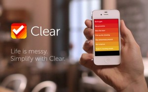
 I used to exclusively make my lists on paper but since I started using an iPhone — I’ve tried lots of apps. Some of my favorites are Astrid, Wunderlist and Ziplist. Most recently I downloaded Clear. It’s the newest breed of productivity app with an amazing design. It costs $1.99 in the Apple app store.
Check out this video from RealMacSoftware.com for a look at how it works:
Clear for iPhone – Available Now! from Realmac Software on Vimeo.
Here’s the pros and cons as I see them:
Pros:
- Stunning design
- Easy & fun to use: swipe to delete or complete, drag to reorder tasks, etc.
- Cute sound effects (if you’re into that type of thing)
- Simple way to keep your to-do list organized
- Use colors to signify priority of tasks
- Great place to keep track of lists of things — like lists of restaurants to try, books to read, tasks to do on a specific day.
Cons:
- Character limit on tasks
- Doesn’t allow you to set reminders or due dates
- Can only view 8 tasks at a time
- Can be a little confusing at times when jumping between the “layers” of menus
Overall I think the design is elegant and very creative. It’s a really fun app to use but it doesn’t have all the functionality of an app like Astrid, which allows you to set reminders, deadlines and share your lists. I will probably use this app to keep track of blog post ideas, long-term goals and quick shopping lists. It’s definitely worth a look if you’re searching for a simple to-do list app.


So funny–I just found out about Clear this week, and while I do use Astrid to handle the multitude of project and work-related tasks, I love the simplicity of this one and do believe it deserves a spot in the suite of list apps. It’s limiting the way Twitter is–and that limit of course has its own elegance and purpose. Same with Clear. I plan on using it for the stuff that speaks for itself, that requires no deadline finagling or social network sharing. I also used the notes app for this on my phone, but find that a bit clumsy and unsophisticated. I spoke with an Apple genius (who told me about this app in fact) and he seemed to think that what was important is that it’s yet another indication of the direction in which apps are moving–as gesture-oriented, not button-oriented. I think we’ll see more of this in future apps for sure. Thanks for this Paula!
Hey Terri — thanks for the comment! I think you’re right — this app fits right in with Apple’s usability. It’s really sleek and easy to use. Let me know how you like using it!
Thanks Darcie for your comment! It’s a cool one to try. I also like Wunderlist — which essentially does the same thing but is free. The thing that is so unique about Clear is the design. It’s a lot of fun to use and it’s easy.
I usually use the “notes” paper on my iphone for my lists – and i seem to have several going a day. But this is a good idea. I’ll check the app out. Thanks